
If you have read my post entitled Creating My Own Font Part 1, then you know that I was hoping to create a pickle-shaped font to spell the word PICKLES. After much trial and error, my daughters and I finally created our own letters using pickles placed on a cutting board. Below are a couple of samples from our pickle photo shoot.


Once I had these pictures, I opened each of them separately in Paint on my computer. I have had very little experience with Paint – I honestly didn’t even know I had it on my computer until I discovered it a few months ago during the process of creating Jobs of a Preschooler. Needless to say, I have done a lot of research, read a lot of information, and watched a few videos to acquaint myself with the program. All I can say is that I am still learning!
Through my research, I have learned that pictures must be 300 dpi in order to print well in the book. Please don’t have me explain what exactly that means – all I know is that dpi stands for dots per inch, and I need 300 of those dots per inch for picture quality. Anyways, I discovered that each of my pictures was only 96 dpi (by going to File and then clicking Properties), which is much less than what I need. When I saw this, I felt quite discouraged because I didn’t know if it would be possible to change the dpi. I played around with my camera for a little bit trying to see if I could change the dpi on that somehow. As I said, I don’t understand all of the technical parts very well, so I’m not sure if that was really even worth looking at. I didn’t find anything to change on my camera, so I began searching “turning pictures into 300 dpi” online.
I found a lot of information for turning pictures into 300 dpi on programs that I do not have. Eventually, I found a tutorial that showed me how to convert pictures into 300 dpi using Paint. Since each letter was a separate picture, I had to format each one individually. I am really hoping that this was worthwhile and that all of the letters will actually turn out well because I have found conflicting statements that say the clarity will remain the same even once the dpi has been changed. I guess I will have to wait until the first proof of the book is printed to see if the letters are as clear as I would like.
Once I changed them all to 300 dpi and saved them (using Save As), I still had a bunch of pictures of pickles on a cutting board, which doesn’t create a good font. After much experimentation, I was able to remove the cutting board from the letters and crop the pictures to create each letter the way that I wanted it to appear. Here are a couple of examples of the same letters I showed you above after I edited and cropped them.


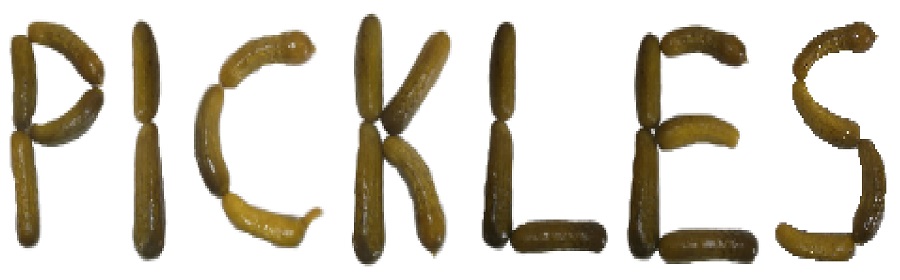
After doing this with each letter, I went into the writing program that I have on my computer and inserted each of the updated pictures individually into the document. I wrapped the pictures as “square” and moved them together to create the word PICKLES. Once they were in the position that I wanted them in, I clicked on each of them and grouped them together to form one complete word instead of 7 separate letters.
Here is the end result of the word PICKLES:

There may have been an easier way to do all of this, but this is how I created my own pickle-shaped font. Now, I will have to figure out how to insert it into the book correctly. I am eager to see how PICKLES will show up once printed in the book. Hopefully, it will turn out well because if it doesn’t, I am not sure what my next option will be.
Have a wonderful day!


